 as the title suggests this the second post in an occasional series pick out things that I have noticed on my design journey I have made. I regularly refer to and learn from surfing branding and design . even working as a designer for surf companies as well. today I am having a look at the hang ten brand (originally set up in california in the early 1960's it soon became one of the major players in the surf industry).
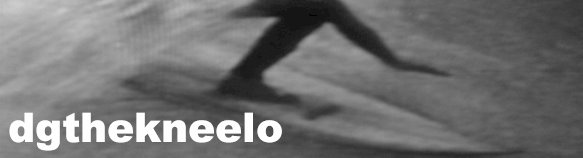
  hang ten (named after the longboard surfing manoeuvre of hanging ten toes over the nose of the board while ridding) has always had a special place in my mind. when I first started surfing in the late 60' s early 70's their shorts were the ones to have, not just because of the advertising hype but they were really good quality.
 almost a victim of its own success it started to licence its brand to any thing and every thing and in so doing diluted the brand so much so its original customers left it to flounder amongst the strength of the Australian based brands of billabong, rip curl, and quiksilver.
they licenced prints for all sorts of things including bed linen and even operating theatre scrubs as below, I don't really like the pastel shades (glad dr ciapparelli wasn't wearing one last week)
 until very recently the brand was in trouble loosing its place amongst the brand leaders in the major markets of the usa, australia and europe. though managing to keep a firm foot hold in asia, especially japan. it just so happens that I am wearing a pair of 'new' hang ten board shorts today see logo below.
until very recently the brand was in trouble loosing its place amongst the brand leaders in the major markets of the usa, australia and europe. though managing to keep a firm foot hold in asia, especially japan. it just so happens that I am wearing a pair of 'new' hang ten board shorts today see logo below. to end this very brief design history of the hang ten brand it is sort of good new as the brand it the process of becoming part of the now large quiksilver operation which should guarantee that hang ten will be set to continue and re-appear and hopefully not go down the road of more bad licensing decisions. below the redesigned logo for 2008


No comments:
Post a Comment